|
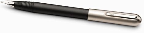
Lamy Persona reviewed by John
The style of the Lamy Persona does not leave you indifferent -- either you love its
Bauhaus minimalism or you hate it. I count myself in the former camp (whereas my wife is
in the latter). The Persona is about the same length and width as the Pelikan M800 but
seems a bit heavier. It is a very reliable pen; however the nib runs wide so my fine is
more like a medium. It lays down a wet line with some variation in line width as well. The
nib itself is extremely plain -- no ornate patterns or two-tone on it -- however its shape
is very attractive and somewhat unusual. Another nice feature of the Persona is that the
cap posts with a satisfying click. The clip is retractable, which, for some users, is a
pain in the neck. Currently, Ashford.com is offering Personas at $99, which is quite a
good value if you like the style of the pen.
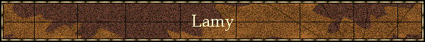
Lamy Persona reviewed by KT Wong
I have two Lamy Personas … the first is a Palladium / Makrolon Persona II which I
bought from Ashford, and the other is a Palladium Persona which I got from www.penbid.com
. My Persona came in a glossy metallic cardboard box which opens to show the pen sitting
on a small piece of black velvet on black folded paper. You also get a box of cartridges
and a converter.
The pen is quite large – it measures 14.5cm capped, 16.8cm posted. The domed cap
contains a spring loaded clip which retracts into the body of the cap – which makes
it look very neat, but also allows your pen to roll off the table! The clip has a
corrugated ridge that needs to be pushed downwards to open it before you can clip it to
your shirt pocket. It’s a rather counter-intuitive movement – most of my other
pens with spring loaded clips will lever open with some pressure making it easy to clip
on, but with some practice, you will get it right!
The Palladium Persona is definitely the more attractive of the two. The body has vertical
ribs, which contrasts nicely with the nib section with its horizontal ribs. A plaque is
attached to the “rear” end of the pen which the cap clicks onto so that it does
not scratch the finish of the pen! This is an example of excellent design and I was most
impressed. Other neat design features include the thread where the cap screws on to which
is nicely integrated with the horizontal ridges, and the unique shape of the nib which
follows the contour of the nib section.
The Persona II contains a Palladium cap and a Makrolon (a type of plastic) barrel, and is
considerably cheaper. It sells for $125 if you buy it off Ashford. On this pen, the body
is smooth but the nib section is ridged. It is also much lighter and so easier to write
with.
Both pens come with 14K nibs, but the Palladium is gold, and the Persona II is white. I
could tell no difference between the two. Both write very smoothly, but the nibs are rigid
as a nail and the writing tends to look a bit characterless. Nevertheless, the pens are
dependable once you break them in. The Persona II was very scratchy and flowed poorly when
I first got it, but I persevered and it now writes a lot better.
I would recommend both these pens as daily writers.
Lamy Safari reviewed by John
Functionality is the name of the game with this pen. The body is done in
a practically unbreakable plastic and looks the part. There are a few design highlights in
the look of the pen. First, the section of the pen features a cleverly designed pair of
flat areas for your fingers. This helps the pen to fit nicely in the hand. Another
highlight is the clip of the pen. It sort of looks like an oversized paper clip and is
actually sort of stylish (or at least clever).Finally, the pen thoughtfully has a pair of
windows carved in the body which let you monitor ink levels whether you're using a
cartridge or a converter. The weight and length of the pen are exactly middle of the road.
While exceeding the very light weight of smaller Pelikans, the Safari is somewhat lighter
than brass bodied pens like the Sonnet.
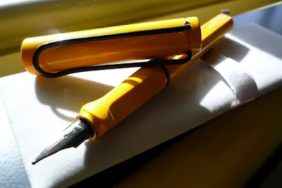
On to the nib. The steel nib is totally without ornament. The version
that I have simpy has the words "M Lamy" lettered on it, but contains no other
decoration. This seems to be a conscious design decision (rather than a cost decision) at
Lamy since even higher end Lamy pens like the Persona contain little nib decoration. The
pen is a smooth and consistent writer straight out of the box. It has makes a somewhat wet
line, but not as wet as many other pens. This, however, is not to say that the ink flow is
at any time inadequate. The nib itself is quite stiff, and, consequently, there is very
little variation in the width or look of the line produced by the pen. The bottom line is
that the pen does exactly what it was designed to do -- produce a consistent, smooth, and
carefree writing experience -- without fanfare and without premium prices.
The downside to the pen is the severity of the design. The pen is fairly
boring to look at in my views. Happily, there's something of a cure for this in the form
of the aluminum bodied Al Star. Taking the body design of the Safari and cladding it in
shiny aluminum dramatically improves the attractiveness of the pen while retaining the
thoughtful design of the Safari. The only drawback is that aluminum is a lot less durable
than unbreakable plastic and the Al Star is prone to denting with rough (or even not so
rough) use. If what you're really after is the pure functionality of the fountain pen
experience, there is no reason to pay any more than the $25 (or less) price for the
Safari.
For more on the Safari, visit the Beginner's Guide
section of the site.
Lamy Joy reviewed by John
All of the talk on the Zoss list and others about pens that give
handwriting character created the irresistible urge to find out more about this for
myself. I already had a Parker Sonnet in my stable and, as this was advertised as having a
flexy nib, I spent some time with it concentrating on varying my writing pressure in
forming different letters in hopes of attaining the nirvana of writing filled with
character. Well, as anyone who's ever tried this with a Sonnet will surely tell you, it is
not especially up to the task.
I then picked up a stub for an old Esterbrook I already had. The stub
wrote smoothly enough (but less smoothly than a conventional nib), however the line
variation required a microscope to detect. I also tried some of the italic nibs that come
in Sheaffer Calligraphy sets. These gave lots of width variation but were not smooth at
all -- at least from my upside down left-handed perspective.
The Lamy Joy was yet another attempt at Nirvana, and I'm happy to say
its the closest to achieving the bliss outcome yet. The pen shares its cap and section
with the Safari. Its barrel is a long tapered design, which is actually annoying since it
makes the pen impossible to carry in a shirt pocket. Despite the tapering, it is possible
to post the cap on this pen. The posted arrangement is odd looking as the diameter of the
cap is much wider than the tapered end of the barrel. This annoyed me enough that I
married the section of the Joy to the barrel and cap of a Safari - thereby creating a
"Frankenjoy" but also improving the portability and, in my view, the aesthetics
of the pen a great deal.
The 1.1mm nib that I have is steel and is up to the same quality as the
Safari -- which is to say reasonably smooth, consistent, but not terribly flexible. In my
limited set of experiences with italics, this is easily the smoothest and most trouble
free.
The beauty is that you get terrific line variation with practically no
effort. I've taken to using this pen every day to record journal entries and I find that
using cursive italic, I get a lovely script at normal writing speed.
Submit your own review -- email it to
jmorgan@gmail.com
|