|
|
|
|
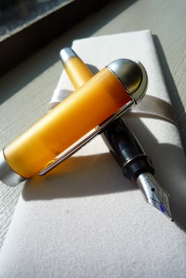
Reviewed on this page: Talentum Ipsilon Style Idea 88 Optima Aurora Talentum reviewed by John I picked up a Talentum in December 2002 as part of an inventory clearance sale at Ashford.com. The version I have is burgundy with silver trim. One of the real draws of this pen is that it shares the same high quality gold nib as the more expensive Aurora Optima and 88. I have the other two models and have found that the nibs on all three were superb performers although they differ a little bit in their writing characteristics despite the fact that all three are medium width. Of the three, the 88 is the smoothest and the Optima the least smooth. The Talentum lies in between. The absence of a "writing on glass" feel for the nibs on the Talentum and the Optima is, I understand, characteristic of Aurora nibs. The closest analogy I can draw is to the suspension in various performance/luxury automobiles. While all are built to absorb large bumps and provide a pleasant ride, cars differ in the "road feel". At times, too smooth a ride can be a bad thing since it disconnects the driver from what the car is up to on the road. Pens are the same way, sometimes it's nice to "feel" the surface of the page, the grain of the paper, and so on while you're writing. The Talentum has that feel to it. Unlike the Optima and the 88, the girth of the Talentum is larger, similar to a Pelikan M800. It's styling is also plainer than either of the more high priced pens. The trim is simple and understated. One sort of interesting visual feature of the pen is the clip, which is hinged where it meets the cap rather than being of the more usual one piece construction. The body of the pen is a simple, monochromatic red color, which is less eye catching than the faceted design of the Optima. The bottom line is that the pen is really emphasizes classic lines and nice, simple design as a writer rather than trying to be a showy piece of writing jewelry. The quality of the overall writing experience is hard to beat at the price I got it for (< $100). Aurora Ipsilon reviewed by Steve Cleary
On first inspection the pen is quite an attractive pen in black
and silver and has a decent weight to it. The cap is an excellent design, firm
to remove and goes back on with a reassuring clunk. Best of all it also posts
on the barrel with the same reassuring clunk. I wish all caps posted as well
as this does as it feels so secure in the hand. The pen fills using either
cartridge or converter and the stainless steel nib (M) is firm, but surprisingly
smooth for a pen of this price and gives a medium wet line. Overall quality of
this pen is very good and although it is not quite as good quality as my
Parker Sonnets I find that it sits in my pocket more often than the Sonnets.
The Ipsilon is a great everyday pen, it is inexpensive and yet writes as well
as pens costing a whole lot more. This pen has impressed me so much that I
intend to buy the deluxe version with the gold nib.
Aurora Style reviewed by Kim Stahler I'd been dying for an Aurora pen, but one thing stood in the
way. I'm poor, a graduate student, and my degree-to-be is one most often found
in the non-profit sector. The Idea looked too...too...something for me - I guess
I wanted just a little more sophistication. Suddenly, Aurora released the Style.
Mine is the chrome/black version with an EF nib. I am well-pleased with this
pen, and it has entered my daily rotation. Aurora 88 (standard size) by John I had been obsessing about Aurora pens for the last several months. Finally, I found a sale on the small size 88 and decided to go for it. Like Pelikan, the quality of the writing for Aurora pens is remarkably consistent up and down the line. One of the things I liked about the idea is that the nib is smooth (but not glassy smooth) and seems to be cut on a slight angle so that there is line variation (subtle but present nonetheless) even in a standard medium nib. The same can be said for the high end nibs on the 88 and the Optima (which I'll get to later). The 88 is understated in style, reflecting the design sensibilities of the 50s and 60s. Apart from the nib, the design elements hearken back to the the pen sharing the same name from that time. Apart from the cap, the pen is extremely light. It is well-balanced with the cap posted, but a bit small in the hand without posting. The body of the pen is a nice glossy black that seems to keep its finish even with daily use. I've been using the pen every day for the last several months with no discernible wear. The cap, which is a Nikargenta in the model a purchased, is heavier than the body and is fluted except at its edges. The clip echoes the classic Aurora clips since the beginnings of the company in 1919. However, unlike these early designs, the clip is unadorned. The only branding on the pen is the inscription "AURORA" in sans serif capitals on the base of the cap. The key to the consistency of the Aurora nibs seems to stem from their standardization. The nib on the 88 is 14kt gold with some sort of overlay to make it silver in color. It shares the same ornate little flourishes as the nib on the Optima and the Talentum, though in the standard size it is smaller than either of these nibs. The flourishes on the nib are sort of jarring in view of the absence of decoration on the rest of the pen. In the original version of the 88, the nib was hooded and without adornment. Hooded nibs have since fallen out of fashion in favor of exposed nibs, but this does give the pen a bit of a schizophrenic design quality. The filling system is a standard cartridge converter. Purists don't like this. Frankly, I don't get the criticism. The converter lets the pen fill from a bottle like any other and it means that in the event that the converter fails, it is cheap and easy to replace. As the filling system is the part of a pen most prone to failure, the modularity of the part seems like an advantage rather than a disadvantage to me. The pen is a smooth and easy writer right out of the box. Some people have complained/observed that Aurora nibs tend to be "toothier" than other brands. For the 88 I have no really found this to be the case. I really don't notice any difference in smoothness relative to many other pens and, as I mentioned before, the slight line variation gives the writing somewhat more character than other medium nibs. The size of the pen is really a matter of personal preference. I find that I can write for extended periods much more easily with pens that are thinner in diameter than those that are thicker. In the case of the 88, I have no noticeable fatigue after several pages of long-hand writing. This is not the case with wider pens like the Pelikan 800. Bottom line: The reliability, character, and ergonimics of the writing make this pen a favorite. The understatement of the style of the pen means that it's not likely to be one that elicits oohs and ahhs from other people. The main shortcoming of the pen for me is the inconsistency of the design between the other parts of the pen and the ornate nib. Aurora Optima by John The Optima is the flagship of the Aurora line. The version I have, which is marbled cobalt blue, is easily one of the most attractive pens I own. In fact, my wife, for whom the attractiveness of the pen is the sine qua non, singled it out as the best-looking pen in my collection. This pen draws heavily on the Aurora designs of the 1930s---the so-called golden age of fountain pens. Looking at the lapis blue Duplex Internazion (Lambrou p. 314), one can see quite clearly the design origin of the Optima. The key differences are that the Internazion is a lever filler whereas the modern Optima is a piston filler, the clip on the Internazion is heavily decorated whereas the Optima is unadorned, and the Internazion is a bit more square whereas the Optima is thicker in the middle than at its ends. Nonetheless, the similarities are striking. One interesting throwback feature of the Optima is the manufacturers imprint on the body of the pen. While imprints on pen bodies were more or less standard in the 30s, they are less often seen today. The imprint on the Optima adds a nice retro feel to the pen. Compared to other flagship pens, the Optima is short, measuring just a bit under 5" capped. This does not, however, affect the balance or ease of use of the pen. With the cap posted, the pen is about 6" long end to end, which is a very reasonable size. The body of the pen is made of celluloid using some proprietary procedure of Aurora's (so that they call it Auroloid). The result is that the pen is blue with lots of little highlights in various lighter and darker blues. There is a lot of depth to the design. The highlight colors appear more or less as irregular shaped polygon "chips" throughout the body and cap of the pen. The accents are gold highlighted by a thick cap band. This band features a kind of Grecian urn geometric motif with the brand "AURORA" subtly blending into the design in blocky sans serif capital letters. The overall effect of the design is to create a stunning and opulent visual impression. The nib is similarly opulent. It is 14kt gold with the usual Aurora flourishes around it. The writing performance is up to Aurora's usual high standards right out of the box. This pen is every so slightly less smooth than the Aurora 88 reviewed above. While not exactly flexible, the nib is cut to create subtle line variation---even from a plain vanilla medium. The ink flow is generous without being ridiculous. In short, it's a pleasure to write with. My only complaint about the pen is to do with its width. It's a bit too wide for my hand so that I fatigue after writing with it for long periods. The style of pens has been to move toward wider models in recent years and the Optima is consistent with this design trend. Still, I'd prefer a somewhat thinner pen. Bottom line: A beautiful and reliable performer.
|