|
|
|
|
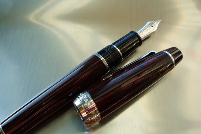
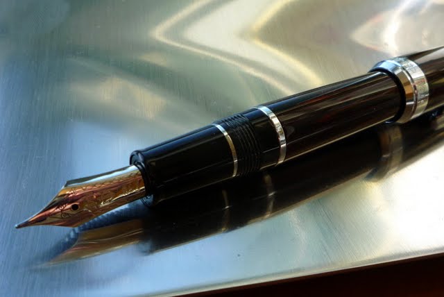
Marble Ebonite Professional Gear by John
I received this pen as a birthday present from my friend (and pen aficionado) Jim Wang. This is a lovely old school styled pen. Made from Ebonite, the two most striking things about it are the swirls of color and the smell. Ebonite, which is an old process using latex, has a distinct "hospital gloves" sort of smell to it. It's kind of odd initially, but soon becomes cool. I had another pen lover visit me and offered him the chance to "smell my pen." He thought it was an odd request, but complied and was immediately floored by how cool smelling it was. The pen 140mm long, about an average size, but runs a bit thicker (grip diameter looks to be about 10mm). I'd say it's pretty close in thickness and feel to an Aurora Optima though it is longer and heavier than that pen. The cap posts securely, but the pen is a slightly top heavy when posted. Not as bad as some pens, like the Visconti Pericles, which are unusable posted, but the center of gravity is definitely toward the posted cap.
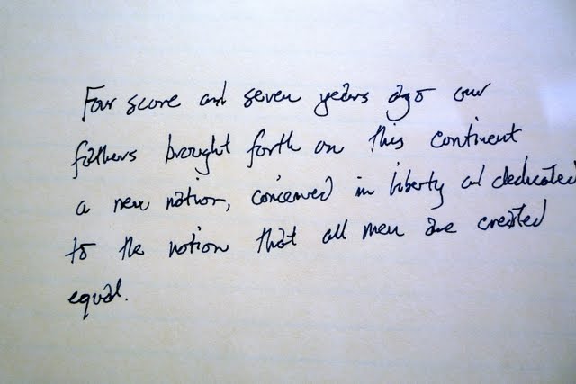
On to the writing quality. As I mentioned above, the writing is smooth and effortless across a variety of types of paper. It's positively silky on Clarefontaine paper, less so on everyday papers but still well above average. As with most modern nibs, it is minimal flex and, as the writing sample above shows, there's not a lot of width difference in the lettering. (Or at least I was not able to produce much of a width difference with my left-handed upside-down script.) Bottom line: It's a carefree, hassle free writer that looks great and, as a bonus, smells interesting. It will definitely be a regular in my rotation. Thanks Jim! Submit your own review -- email it to jmorgan@gmail.com |