|
The Sheaffer Intrigue
and the Guggenheim Bilbao: Eerie Parallels by John
Lately, I've been so in the throes of my pen obsession
that I've taken to coveting them. I'll pore over the Fountain Pen Hospital catalog (the
2001 just arrived) and read the ad copy as carefully as a rabbi might read the Torah. In
fact, I find myself believing the ad copy at times. My endless fascination with the
Intrigue was one of those times. Hear the siren song: "Once in a generation a new
design icon is born...the Sheaffer Intrigue typifies such an icon ... superior performance
... extraordinary finishes." and so on.
Somehow, I had my heart set on the whale shark pattern
of the Intrigue and, as it was the holiday season, I made sure to publicize this fact to
my wife and any other family members who I thought might be co-opted into feeding my
habit. I even helpfully included a handy Ashford coupon code to ensure maximal
affordability of my once in a lifetime design icon.
Well, Christmas arrived and I guess I was good this year
since Santa brought me my one true heart's desire in a medium nib. As I was at a family
party at the time I got it, it wouldn't do to get out a bunch of ink and load it up
immediately, so instead I stared at the pen longingly and noticed its design and
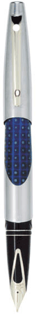
craftsmanship. First the craftsmanship: The Intrigue has, to my knowledge, a unique filing
system. The converter is insert into a drawer in the barrel of the pen. Screwing in the
barrel meshes the teeth of the converter with teeth that are installed in the blind cap.
By turning the blind cap, the teeth cause the plunger of the converter to move in and out.
Thus, the Intrigue manages to achieve a similar ink filling technology to a piston filler
while retaining the convenience of switching to cartridges. So far, the ad copy was right
on the mark - advanced technology indeed.
The pen is quite interesting looking as well. It is a
mix of textures and colors with curving surfaces everywhere. Last summer, I was at the
Guggenheim in Bilbao which is a metal (titanium) skinned building with a myriad of curved
surfaces. The architect, Frank Gehry, said that he wanted the building to be like a fish
leaping out of the river. Well, the Intrigue is in the same design spirit. (Note to
Sheaffer, the comparison to the Guggenheim would make even better ad copy than what they
currently have.) Even my wife, who dislikes modern design, was taken with the pen. So far,
so good -- extraordinary finishes - check.
The thing that's disconcerting about the Guggenheim is
that, on going inside, one cannot help but be underwhelmed with the poor quality of the
collection. In an eerily parallel fashion, the same seems to be true of the Intrigue. I
initially filled the pen with Montblanc blue-black ink (which I know is bad, but I got as
a gift). The pen did not like this ink at all. In skipped quite frequently and made
extremely inconsistent ink flow. When it worked it was smooth, but the problems distracted
and detracted from the writing experience. I thought a mild detergent solution combined
with trusty Waterman Florida Blue would fix the problem. Indeed, it did flow much more
freely and without skips, but now the ink flowed too freely. The pen became practically a
paintbrush and feathered on every use.
Well, it was immediately apparent that this was bad
experimental design (changed two things at once) so I switched back to the Montblanc
on the theory that the detergent would work its magic. This theory, however,
was quickly falsified. The pen immediately reverted to its balky and
skipping ways. Back to Waterman - less of a paintbrush but still some
feathering. Indeed, it is remarkable how different the line the pen makes is
with these two inks.
Bottom line: Well, at this point, there is no bottom
line. The jury is still out on this pen. If it would mend its wayward ways as a writer, it
could become a favorite. Stay tuned for a second look in the weeks to come.
Sheaffer Intrigue -- One Year
Later
It's been almost a year since I
received my Intrigue. So here's the follow-up.
While I still think the pen is
very stylish and interesting, it ultimately never did find its way to
becoming one of my most favored writers. This was due to three main reasons.
First, despite wanting to
embrace the fat designs that it seems everyone is now attracted to in pendom
these days, the combination of the diameter and weight of the pen make it
simply not comfortable to write with for extended periods. The key
difficulty for me is that the grip places the pen directly against the
muscle connecting my thumb to the rest of my hand. In the course of writing,
this muscle tenses and relaxes many times and the pressure of the pen
against the muscle fatigues it.
The second problem with the pen
is that it never really did get all that smooth. After improving initially,
the pen reached a steady state where there was always an undercurrent of
roughness on ordinary paper (not so with Clairefontaine paper where every
pen is smooth). While not unpleasant, the roughness compares favorably to
smooth and wonderful writers like the Pelikan M600 and the Parker Duofold.
Like many pens, the roughness can be minimized if you're lucky enough to
hold the pen at exactly the correct angle, but finding this sweet spot is
elusive on the Intrigue.
The third problem is with the
slight skipping. As I mentioned in my earlier review, this pen was prone to
occasionally skip at the start of letter right from when I first got it. It
still is prone to this problem. Ironically, the skipping, which might seem
like the most serious of the problems, is actually the least serious.
Correcting the occasionally missing downstroke is not a serious difficulty.
Correcting the ergonomics and smoothness of the pen, on the other hand, is
impossible.
In its current incarnation, this
pen is never going to become a favorite, so it's off to Fort Madison for a
new nib. We'll see how this chapter of the saga goes.
Two Years Later
I have a new rule -- if I'm
unhappy with a nib rather than playing around with it, as was my wont
before, it goes back to the manufacturer for an exchange. This means I have
to choose some new sized nib to replace it. It turns out that an exchange is
a much easier and faster transaction with all pen companies than asking them
to "fix" a problem while leaving the nib the same size. Fixing often leads
to unsatisfactory results and takes longer. What would be nice would be if
one could simply tell the manufacturer to swap the nib for another one of
the same size, but this does not seem to work in practice. In any event, I
swapped the nib for a stub nib figuring that at least the pen would be used
for variety's sake. This proved to be a great choice. The pen came back
outfitted with a smooth and wonderful stub nib (although it looks for all
the world like an italic). It glides across the page without skips or
hesitation. Line variation is quite good as well. Now this is the pen of
choice when I write short notes to people and want the writing to look
pretty. I've been using it continuously for this purpose for the last six
months and love the pen. It's nice that, at last there is a happy ending.
Sheaffer Intrigue reviewed by
Kit
Oh dear, this was a disaster for me. The pen wrote
OK in the shop, although I was not completely convinced. I liked the
design, so I bought it anyway. I had a lot of trouble with the pen from
the time I first filled it. It would start extremely badly, sometimes
taking up to three or four strokes to get going. The downstroke frequently
skipped.
A lot of people have been impressed by the filling
mechanism, but I have to say that I was unconvinced. I found that the
teeth did not always seam to engage with the mechanism inside and I
certainly had trouble at times filling the pen.
The real problem I encountered though was the cap.
The cap is cut at an angle. If you do not click the cap on in the right
position it puts pressure on the barrel at an angle. Now the nib unit is
attached as normal by a screw thread to the barrel. Both parts of the pen
that meet in this screw are made of plastic. I never replaced the cap with
much force but the accumulative effect of pushing the cap on at the wrong
angle for several weeks eventually caused the thread to break and the pen
fell apart.
I took the pen back to the shop and they replaced it
with a Cross, which I have been extremely happy with. Unfortunately, the
experience has put me off Sheaffers.
Sheaffer Legacy reviewed by John

Arcamax has proved to be a boon
when it comes to Sheaffer pens. I've vastly increased the number of
Sheaffers I own as a result of this site. Of the pens I acquired, far and
away my favorite is the Legacy. I was initially skeptical as to whether I
would like this pen. In the course of using a variety of different pens, I
found that thinner (but not too thin) and lighter pens were much more
comfortable for long runs of writing than fatter and heavier designs. The
Legacy is lacquer over brass, so it's not a light pen, and it gets
reasonably wide reasonably fast, so it's not really a thin pen. Hence, my
skepticism. Still, the price was so low that I couldn't pass up a chance to
own Sheaffer's flagship pen.
These fears proved not to have
as much impact as I might have guessed. While the brass body of the pen does
make it heavier than the modern Parker Duofold (my all-time favorite
writer), the balance is such that I did not really feel the weight very
much. This is in contrast to say a Pelikan M800, where I definitely feel the
weight after not too long a period of writing. The width of the pen is
deceptive. While at its thickest point the pen is quite fat, it tapers
severely near the nib and, as a result, it's actually quite comfortable to
use (more comfortable than the 800 or the Waterman Man 100). So, despite my
earlier trepidation, the ergonomics on this pen are above average.
When it comes to writing, the
inconsistency of Sheaffer's nibs continued to be a problem. The pen shipped
from Arcamax came with a medium nib, which was scratchy and not very
generous in its ink flow. At the same time, the medium seemed to run a bit
wider than I might have liked. I've now come to the conclusion that there's
little point in fiddling with or putting up with a substandard nib from
manufacturers that do such a good job with nib exchanges, as is the case
with Sheaffer. So off it went for a nib exchange to a fine nib.
The exchange went quickly and
without any problems whatsoever. Sheaffer is the gold standard when it comes
to turnaround time without hassle on these sorts of transactions. Within 3
weeks of sending it, I had the pen back with a fine nib. This time, the pen
wrote like a dream. The fine nib, which runs a bit wider than the usual fine
(it's wider than Waterman or Pelikan for instance) was a smooth and easy
writer with quite generous ink flow. In short, this nib was a winner.
The combination of the
ergonomics and the quality of the writing experience have moved this pen up
into the first tier of user pens in my stable.
Sheaffer Crest reviewed by John

The Crest was admittedly not on
the radar screen at all until it showed up at Arcamax some months ago. It
seems odd to be buying a new vintage pen, but that's what Arcamax is
offering. Crests haven't been made in years and I suppose Arcamax's cache
was dug out of some basement in Fort Madison.
A big part of the attraction of
this pen for me was its conical Triumph nib. The Triumph is a design classic
dating back to the 40s. While the conventional wisdom is that the inlaid nib
of the PFM and the Legacy is Sheaffer's design trademark, to me, the Triumph
represents the true high point of Sheaffer nib design. As seems to be always
the case with Sheaffer, the nib is minimally ornamented. Only the words "Sheaffer
18k 750" and some sort of tiny arcane symbol grace the nib. This is fine
since the two tone styling and wraparound design of the nib itself is really
the star here.
The other part of the attraction
of this pen is its price. After coupons, it ended up costing just $56
including shipping. This is truly a brilliant price for a pen of this
quality.
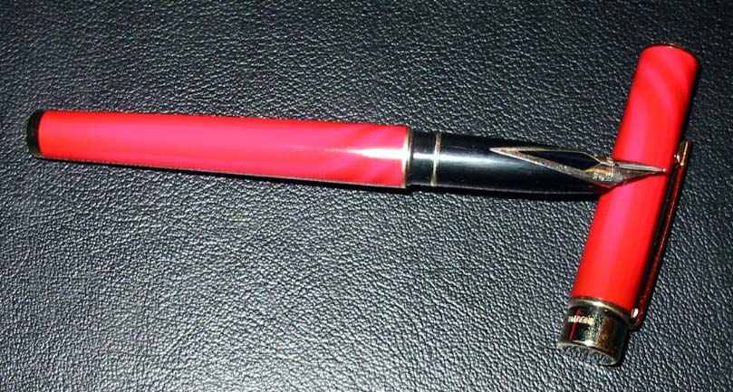
The pen itself is a lacquer over
brass design. The version I have is red with Jackson Pollock like drizzles
of fire engine red over the base color, which is a darker red. When closed,
the only accents on the pen are the quarter inch wide cap ring and the gold
clip with the signature white dot. The profile of the pen is thin and
streamlined. The closest comparison in terms of overall dimensions is a
Parker Sonnet, though the Crest is thinner and longer.
The thin design of the pen is
another feature that distinguishes it as part of a bygone age. Pens have
tended to become wider in diameter over the last ten or so years. My current
theory on this is that it reflects an attempt to appeal to an increasingly
graying fountain pen user population, who finds thicker pens easier to
handle. I myself, however, find thin (but not too thin) pens to be much
better for extended writing. I prefer the Pelikan M600 to the M800. I prefer
the international sized Duofold to the centennial, and I prefer the Crest to
thicker pens like the Intrigue.
Another retro feature of the pen
is decidedly less charming. Instead of the usual piston converter, the Crest
kits out with an aerometric converter. The aerometric seems to me to be
worse in all dimensions -- it's harder to monitor the ink level, it's harder
to fill, it has a smaller ink capacity, and it has a shorter lifespan than
the piston converter. Here is clearly a case where progress improved the
product.
In a few test attempts, the cap
posts securely on the pen, though the balance is good with or without the
cap posted. Alarms have been sounded in some newsgroups that posting the cap
quickly damages the lacquer at the barrel end of the pen. This is not a good
design feature and has kept me from posting the cap.
So how does it write? Trolling
through the archives of alt.collecting.pens-pencils, one finds numerous
testaments to the ultimate smoothness of this pen, so I was looking forward
to a superlative writing experience. What I could not control, however, was
the size of the nib I would receive -- Arcamax seems to choose at random
regardless of what you request. In any event, my pen arrived with an extra
fine nib. As I like fine nibs, I thought this might be even better than
anything I might have hoped for. The pen wrote without incident straight out
of the box. Moreover, the nibs seem to run a little wide, so the line was
very similar to that produced by a Waterman Opera or an M800 in fine. So far
so good. There was, however, a toothiness to the writing that I could have
done without. While the experience was good, it was not the ultimate in
smoothness by any means. Ink flow was quite generous for an extra fine.
After having lived with the pen
for about a week or so, I've gradually adapted to the pen's quirks and found
the writing sweet spot. This has reduced the toothiness by a considerable
amount although the pen still does not rank among the smoothest writers
though it's not really scratchy either. The best description I can offer is
that there is a kind of buzzing in one's hand while writing.
Now, should I exchange it? My
guess is that the problems I'm describing are too marginal to be very likely
to be fixed. Moreover, some on the web have offered the view that the slight
roughness I'm describing is standard operating procedure for Sheaffer.
According to this view, Sheaffer slits and polishes their tipping material,
but does not separately shape it. As a consequence of this lack of shaping,
one ends up with a slight roughness on some papers. Or so goes the theory at
least. If this view is correct, then an exchange is unlikely to yield
anything much better. See when to
exchange a nib for more musings on this.
My bottom line is still a buy
recommendation -- for the Arcamax price, this is a tremendously good value.
Sheaffer Targa reviewed by John
Once again, the lure of Arcamax
proved too great to resist. I picked up a Targa in the red rings pattern
from them. It is hard to tell from the pictures on the web exactly
what this pattern will look like. I was surprised at how red it was (like a
fire engine red) and how invisible the rings were. They are a slightly
lighter shade of red running in a fairly random pattern along the
circumference of the barrel and cap. It was not as attractive a design as I
might have hoped.
The Targa design has been around
forever and has a kind of 1970s feel to it. It is squared off at each end
and boasts some gold trim, but not so much as what one finds in more recent
pen designs. The pen itself is lacquer over brass construction with
Sheaffer's signature inlaid gold nib. The barrel of the pen is of a constant
and moderate width, but it tapers severely at the section. There is a
distinct "step" in the profile of the pen where the barrel meets up with the
section. The fact that the pen is of only moderate girth is also indicative
of its origins in the 70s, when pens were generally thinner than they are
now. For me, this is an attractive property.
My theory is that wider pens are
generally less useful for long spates of writing for the average user. See
my theory of the life
cycle of fountain pens for more on this. In any event, the pens that I
prefer are light and of medium width, so I figured the Targa was likely to
be a winner. In terms of ergonomics it is quite good.
The nib is a smooth fine nib,
but the ink flow in the model I received is a bit stingy. Using a more
saturated ink like Waterman Florida Blue leads to good results. Less
saturated inks like Skrip, however, leave a thin and washed out line.
Somehow though, this pen is not as fun and exciting to use as it should be.
Sheaffer Prelude reviewed by John
The Sheaffer Prelude is an entry
level pen in Sheaffer's line. It has recently been discontinued. It would
seem like this pen is competing in the same product space as the Waterman
Phileas and the Pelikan M200. I think it is inferior to either of these
pens. The Prelude is lacquer over brass, which gives it reasonable heft for
a fairly small size pen. It's dimensions are most similar to a Parker
Sonnet. Unlike the Sonnet, the section is made of plastic with a molded grip
section. In principle, this is supposed to be an ergonomic enhancement, but,
as a left hander, I find it to be worse than useless. The girth of the pen
is fairly thin (again about the same at the Sonnet.) The pen comes with a
two-tone gilt nib with a small swirl design on it. It's quite similar to the
Phileas in this regard.
The version I had was black
matte and came with a broad nib. It produced generous inkflow for the most
part (but not too generous, which is a danger with broad nibs). The writing
experience was solid but unspectacular. On the scale of smoothness, it was
average at best---not rough but not exactly gliding across the page.
Occasionally, the pen would skip on the initial downstroke of a paragraph.
Enough to be a bit of an annoyance, but not enough to be a really serious
problem.
In the end, I gave the pen away
because while it was reliable and attractive enough, it was a bit worse in
all dimensions than its competitors.
Sheaffer Balance II reviewed
by Kim Stahler
My black Balance was one of my first decent pens and a steal at the Philly airport pen
kiosk for $50 (was flying out for a cruise, and while on the ship, I kept getting the pen
out to proudly look it over. No one understood my admiring glances though). The medium nib
had been a tester model, but I knew I would send it in for a nib switch anyway. I had only
ever seen the Balance in books and on the net, and it was bigger than expected, though it
is not considered to be a large pen. It is very glossy.
Balance II is very light and comfortable in the hand with its shapely section, and its
retro understated style is always pleasing to me. I do wish the posted cap stayed on a bit
better. The way I hold my pen causes me to bump it off constantly. My XF nib is wet and
writes like a dream. The
nib initially seemed to be too fine, but after a day or two, it broke in beautifully.
There is a slight bit of flex that is more like softness in the 14ct nib, though I get
only very light line variation on the page. This pen spent a hot summer under the car seat
in my husband's black automobile, and yet wrote for me almost right away when I joyfully
found it. The clip is the authentic shape, but not very easy to clip on to a woman's
jacket edge, since there is little give and I fear springing the clip. I learned the hard
way not to clip things to my jacket any after a Pelikan hit the floor, and a vintage
Waterman left only its cap. I admire the 2 Levenger Balance finishes (Tiger Eye with gold
and Aspen with palladium trim) and may just have to get one these upon finishing graduate
school.
Sheaffer No Nonsense reviewed by John
You might not suspect it, but the Sheaffer No Nonsense is a design
classic hearkening back to the golden age of fountain pens in the 20s and 30s. At that
time, the stylings of many pens, including the Sheaffer Lifetime, featured somewhat hefty
bodies with squared off ends. This style has since gone out (40s -70s) and then come back
in (80s - present) fashion and the No Nonsense pays homage to the timelessness of the
design.
Interestingly, it's not all that easy to buy a No Nonsense by itself
these days. These pens are most often found packaged as part of calligrahpy sets, where
the come with multiple italic nibs and a bunch of cartridges. One exception is the lovely Festive
Fountain Pen set offered by Levenger. This set features Red and Green marbled No
Nonsense pens with gilt nibs in medium. The version that I got threw in two bottles of
Levenger ink, but it looks like they are no longer doing this. Total cost of the package
is $20. In addition to the marbled finished and gilt nibs, the other design highlight is
the presence of gold (colored) accents including a cap jewel. All of these features
distinguish the Levenger offerings from what you get in the calligraphy sets. Also, unlike
the calligraphy sets, these pens come with two converters for using bottle ink.
Because of the thickness of the plastic, the pen has reasonable heft --
about the same as the Lamy Safari. The pen is well balanced whether the cap is posted or
not. The writing quality is smooth and consistent. I've had no difficulties with skips,
starts, or skimpiness in ink flow. The pen worked well straight from the box. Indeed, it
is hard to find anything much wrong with these pens.
Here are a few drawbacks though. First, the pen tends to show wear
fairly quickly. Specifically, the plastic of the body develops micro scratches from
ordinary use and the collective effect is to give the pens a shopworn quality after a
period of a year or less. Second, while the pen is a good writer, it is still a notch
below the Safari in overall performance. Third, all bets are off when it comes to the
italic nibs that come in the calligraphy sets. The italics tend to be scratchier and
fussier than the gilt nibs in the Levenger package. Of course, the upside is that you get
nice line variation in the italic. Still, the Lamy Joy blows the italic nibs away in terms
of overall performance. The filling system is cartridge/converter where the converter is
an aerometric type. The converter is just not very good at providing much ink capacity.
This isn't fatal, but is annoying.
Bottom line: The Levenger pen set offers a risk free and very enjoyable
way for someone new to fountain pens to take the plunge. At only $20, it offers an
outstanding value and nice style. For more on the No Nonsense, visit the Cheap Thrills section of the site.
Incidentally, this is the pen Katherine Harris used to sign the Florida
vote certification in the Bush-Gore elections.
Submit your own review -- email it to
jmorgan@gmail.com
|